Increasing Program Utilization
I increased the utilization of a core feature within
CareMessage's patient engagement software
by helping users better understand its functionality.
Project Overview
Client
CareMessage, a B2B SaaS nonprofit which aims to leverage technology to help safety net organizations fulfill the essential needs of underserved populations.
Challenge
Increase utilization of a messaging functionality by designing a new workflow that is intuitive and user-friendly.
My Role
Lead Product Designer
Timeframe
6 months
Problem
CareMessage's health education programs improve patient's well-being by providing targeted information via text messaging about specific medical conditions.

Due to the sensitive and potentially high-risk content in the messages, users were required to opt in to these programs. The process of opting in required users to manually ask a CareMessage representative to add these programs to their accounts.

This process was cumbersome and unclear, resulting in significantly lower utilization of this messaging functionality compared to the other features offered within CareMessage.
Solution
I designed a feature that showcases CareMessage's health education texting programs to encourage utilization. Users can browse through and learn about the program offerings and select programs to add to their accounts. After enrolling patients into a program, users can monitor metrics and analyze responses to see what messaging resonates best with their patient population.
Design Details
Previously, CareMessage account managers were responsible for informing users about programs. Users could not learn about or select programs within the app. This lack of visibility resulted in lower utilization compared to other messaging features.

The main problems with the existing workflow were:

•  Users had difficulty conceptualizing the program feature.
•  Users did not know which programs were offered.
•  Users did not know how to request programs.

To solve these problems, I defined what the ideal workflow would look like. Users should be able to:

1. Browse through program options
2. Select a program
3. Enroll patients in the program
4. Monitor patient progress, metrics, and responses

Breaking down the main functionalities helped influence the feature's information architecture, which then defined the different interfaces that would make up the complete feature.

Each interface I developed was in response to a specific need identified in user research. The following sections outline the different user needs and the corresponding interface(s) that solved that need.
Browsing Program Offerings
Improving Learnability
User Need
Understand what programs are, which ones are available, and how to use them.
Solution
Create an "Explore Programs" interface that explains what programs are and allows users to browse through the different options.
After sketching out ideas and creating some low-fidelity wireframes to share with users, we learned that users preferred an interface where they could first see all the programs available, and then choose which ones they wanted to learn more about.

Users wanted to see high-level information about a program (but noted that too much detail would be overwhelming) and be able to easily compare programs to one another.
The MVP we first released had a simplified navigation and only listed a few programs, with the idea that we would monitor adoption and build out the full interface listing all the programs if we saw significant adoption rates.
Defaulting to the program overview tab improves the feature's learnability and ensures that a lack of knowledge is not a barrier to use.
I visualized these programs using friendly illustrations and bright colors to help users feel more comfortable trying the feature. Similar programs are grouped together in the navigation menu, allowing users to better understand the different types of programs that are offered.
After clicking on a program, users can read more about the specifics of it and see message examples. The "Ideal For" section clearly outlines which patients would benefit most from a program, so users can feel confident choosing which of their patients to enroll.
Setting User Expectations
User Need
Know what to expect next after selecting a program.
Solution
After users select a program, show a confirmation modal outlining what will happen next.
After selecting a program, this modal informs users that they will receive an email with the next steps and references the email sender so users know what to look for.
Program Management
First-Time User Experience
User Need
Know how to add programs to my account.
Solution
If users navigate to the Program List before adding programs, the empty state page informs users how and where they can add programs.
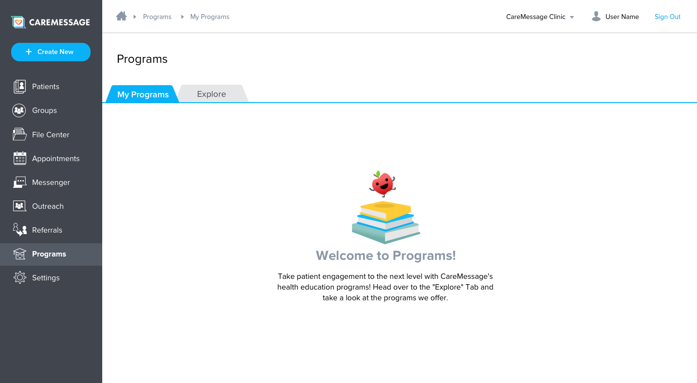
Users need to add programs to their account before they can enroll patients. To ensure it is clear how to do this, if users navigate to the Program List before adding programs, they see a friendly illustration and informative text that explains the feature and directs users to the appropriate next step.
Viewing Program List
User Needs
See a list of my programs.
Solution
Once users have selected programs, the "My Programs" tab shows a list of all the programs added to their account. Newly added programs are listed first by default.
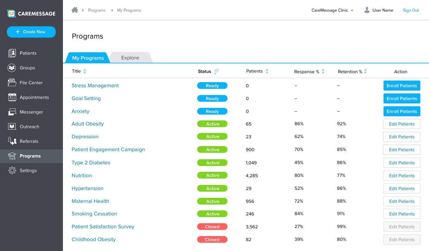
When viewing the list of programs in a user's account, the programs with 0 patients enrolled are listed first by default, and the call to action button for these programs is highlighted in blue. These design decisions help guide and encourage users to enroll patients, which avoids situations where users select a program but forget to enroll patients into that program.
Comparing Program Metrics
User Need
Know which programs resonate best with my patients.
Solution
Display the key messaging metrics for each program and allow users to sort the list by these metrics.
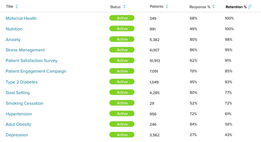
Users can sort each column of the program list to see how key metrics, like response and retention rates, compare across their programs. This helps users identify which programs resonated best with their patient population.
Enrolling Patients
User Need
Enroll patients into a recently added program.
Solution
Users can enroll patients directly from the program list by clicking the prominent call-to-action button next to programs with 0 patients enrolled.
Clicking "Enroll Patients" opens the patient enrollment modal, where users can apply filters to help them select which patients they want to enroll.
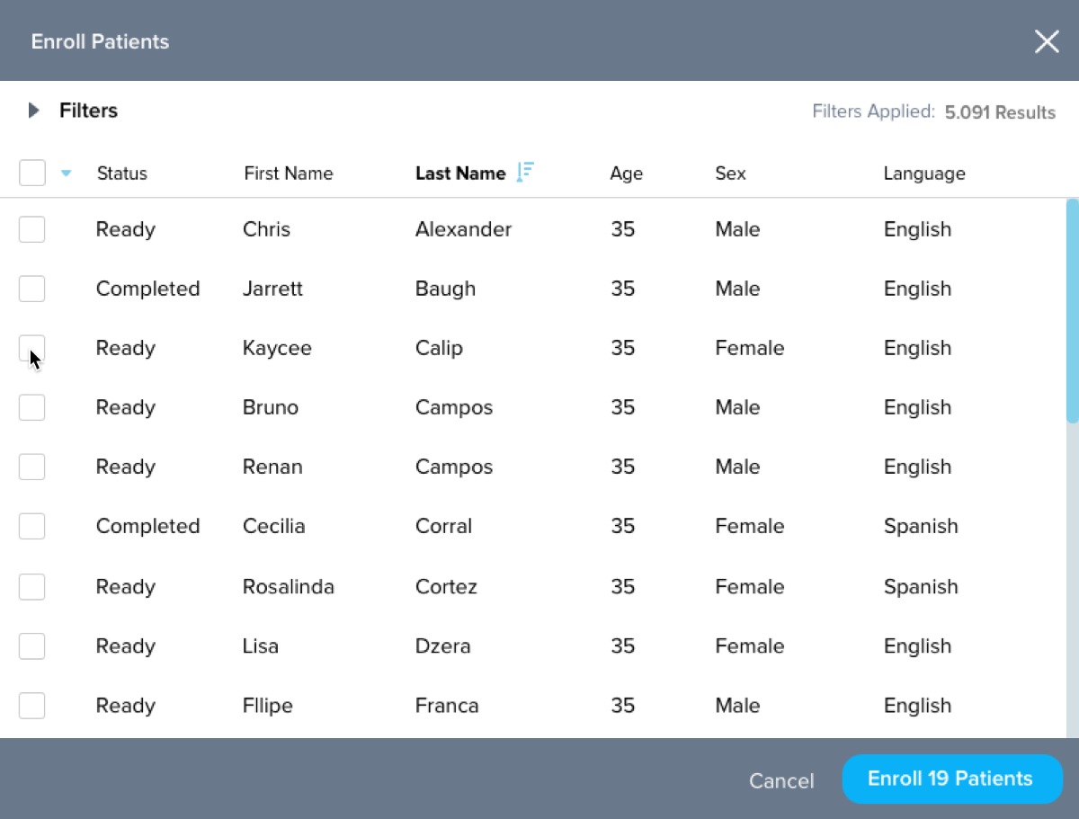
After applying filters, users can mass select or individually select patients to enroll. The "Status" column informs users if this patient has already been enrolled, in case users don't want to enroll a patient again. The "Enroll X Patients" button helps users keep track of how many patients they selected.
Monitoring Progress
User Need
View metrics and patient progress within a program.
Solution
Users can click a program name from the list page to see more details, including messaging metrics and patient responses.
After selecting a program, users can toggle between the "Summary" tab, which shows messaging and response metrics, and the "Patients" tab, which shows responses broken down by individual patients.
View Program Summary
User Need
Evaluate how specific programs and messages are resonating with patients.
Solution
Show a dashboard summarizing metrics and patient enrollment for a specific program.
This dashboard provides users with a high-level overview of a patient's metrics and patient enrollment. To see insights for specific messages, users can scroll through a carousel of aggregated patient responses.
The program metrics section shows the top three messaging metrics users are concerned about.
The patient status graph helps users visualize patient progress in a program. This helps users see how many patients have not yet been messaged, are actively being messaged, and have completed the program.
Messages that ask patients a question are displayed in a 3-card carousel format, allowing users to easily see aggregated message responses. This gives users deeper insight into their patient population and helps them see how patients changed throughout the course of the program.
Monitor Patient Responses
User Need
See patients' responses to a program.
Solution
List all the patients enrolled in a program. Use a split screen layout to show a selected patient's messaging history within the program.
If users are looking for a specific patient's response to a message, they can use the search and filter functionality within the patient tab. Filtered lists can be downloaded if a response requires follow-up outside of the app.
Result & Next Steps
To test the impact of visualizing these programs, the initial MVP only listed 6 of the 20+ programs that CareMessage offered. After a few months analyzing user behavior, our team found that the programs listed on the app were requested by users 4x more often than programs not listed on the app.

Additionally, we found that 78% of users who clicked on an individual program to learn more about it ended up selecting that program to be added to their account.

These successes validated our assumption that users preferred the in-app workflow and provided justification to add additional programs within the application.
lisa@lisadzera.com
© Lisa Dzera 2023